


Considering the renewed prevalence of the portentous symbol originally intended to be associated with biohazardous waste/that which might be harmful to human health, it bears noting how and why the symbol came to be. Created in 1966 by Charles Baldwin, who, and here’s where the ironic kicker begins, worked for Dow Chemical, the design was intended to be, as Baldwin put it, “memorable but meaningless.” Kind of like what most of the victims of the coronavirus will become when the collective statistics of contraction and death are tallied. Of course, Baldwin’s intent behind such a phrase was that, in conjunction with the National Institutes of Health, they were working to adopt a symbol from scratch–one that would have no prior associations with anything else. And one that essentially needed to be invented precisely because of the existence of a company like Dow.
The difficulty in doing so was greater than one might imagine, for it’s an extreme challenge to come up with a visual language that is universally understood and immediately recognized (much the same way as it’s taken people to universally recognize coronavirus as a real threat). But leave it to a team of “Dow artists” to achieve such a goal. For prior to their generation of this graphic, there was a confusing array of biohazardous warnings depending on one’s industry. That a biological threat covers a gamut of “instances”–most invisible–including toxins, microorganisms and yes, viruses–meant that the need for such a sign existed not just at chemical companies like Dow, but also the U.S. Army, Navy and Universal Postal Union. The time had come to acknowledge that living in a post-war-turned-nuclear and chemical warfare threat epoch meant inventing an emblem of extreme warning, an emblem, ultimately, that would come to signify existence in the modern world as we know it–traceable, at this point, to the mid-twentieth century, when corporations truly saw the rise in their endless heyday.
Thus, at the top of the list of the criteria for charting this unprecedented badge of risk was: “Striking in form in order to draw immediate attention” (at the bottom of the list of priorities, quelle surprise, was: “Acceptable to groups of varying ethnic backgrounds”). And yes, the biohazard “logo” certainly is that. In certain ways, however, it mimics almost too closely the Fallout Shelter sign (which stemmed from the ionizing radiation symbol), created slightly before in 1961, under the advisement of a psychologist seeking the same tenets Baldwin and his ilk were going for: “a visual symbol that could be easily identified and remembered. The sign had to meet the psychological requirements of simplicity, easy identification, retention and arresting color combination. It had to be simple enough to be easily identified by children, non-English speaking persons or others who may not be able to read” (America has a flawed education system, after all).
The stipulations continued, “The color combination, yellow and black, is considered as the most easily identified attention getter by psychologists and the graphic arts industry. The sign can [therefore] be seen and recognized at distances up to 200 feet.” The biohazard symbol very much fits the same bill, and it bears accenting the fact that both of these designs were attended to in the 1960s, at one of the heights of all-out societal chaos as wars, governmental subterfuge, bombings, assassinations and social paradigm shifts raged throughout the decade. That 2020 seems to be kicking off with even more “panache” makes the 60s-helmed biohazard symbol’s increased prevalence somehow even more poetic as the world faces a crisis unlike it has even known in modern history (and, for the love of God or whoever, please stop citing the Spanish flu as a comparison, for back then, the news was even more manipulable so as to contain people’s panic, which is why most of the reports of this flu were stated to be in Spain, neutral journalism reporting territory during WWI).
The urgency–the sheer sense of “SHIT IS ABOUT TO GET REAL” cachet–of its obnoxiously-toned black and yellow (sometimes black and red or black and orange) eventually achieved the desired effect. For there are few, if any, who don’t recognize what it means–or if they don’t, then surely they have enough brain cells left to inuit that it signals something pretty goddamn ominous.
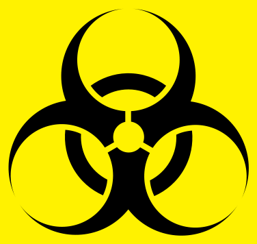
Because, indeed, there was methodical effort put into the meaning of each of the four circles, demarcating the chain of infection, starting with: “agent: the type of microorganism, that causes infection or hazardous condition; host: the organism in which the microorganism infects; source: the host from which the microorganism originates (the carrier host might not show symptoms); transmission: the means of transmission, mostly direct or indirect (some routes of transmission include air, insect, direct contact and contaminated surfaces).” No shit to that latter parenthetical.
After testing out a number of the potential symbols they had drawn up as well as a number of already easily recognizable corporate symbols (like Mr. Peanut, who was much more popular then) on sample audiences, it was one in particular that stood out. Conveniently enough, it was also one that could be recognized regardless of which way it was stamped or stickered or stenciled onto a box, wall, barrel, door, etc. That Dow Chemical’s increased propensity for rogue behavior in chemical use and testing ramped up around this time is also telling of a “sudden” need to create such a symbol, which, as stated by Baldwin, “shall be used to signify the actual or potential presence of a biohazard and shall identify equipment, containers, rooms, materials, experimental animals or combinations thereof which contain or are contaminated with viable hazardous agents.” Co-writing with National Institutes of Health’s Robert S. Runkle, it was added that a “biohazard” applies to “those infectious agents presenting a risk or potential risk to the well being of man, either directly through his infection or indirectly through disruption of his environment.” A.k.a.: a virus.
What’s more, it’s a bit eerie that the symbol was created so late in the game called nuclear and chemical testing that went largely unchecked in the 1940s through the 1960s–just as it’s a bit eerie that the EPA wasn’t even established until 1970, humorously enough, upon the executive order of Richard “Napalm” Nixon. Then again, his championing of it is likely why it has very limited authority without corporation-controlled Congress. An entity itself that ought to have a biohazard symbol on every door of its chambers, incidentally.


